CBi casts its expert eye on own image, unveils new look

CBi has turned its expertise upon itself to develop a new corporate image, including a new logo and website, that more accurately reflects its aims and values.
To fulfil its role as a beacon for empowering design through cultural and consumer insights, CBi lead by example in the development of its new image. Following an intensive period of research that included analysis of the company’s internal culture, branding and external perception, CBi came up with a raft of measures to better communicate its core values.
“Our new visual identity and culture match our reputation, philosophy and vision for the the future,” said Rudy Wimmer, managing partner of CBi. “We are growing, and we have realized that to do this successfully, we need a deep-rooted culture built by a group of smart, talented people. This culture is clearly communicated in our new look.”
The biggest point that came out of CBi’s self-analysis was that its previous branding had been selling the company short by failing to convey the creativity and passion that drive CBi.
With the findings of its self-appraisal in hand, CBi did what it would advise any of its clients to do: make changes based on these insights to see your business flourish.
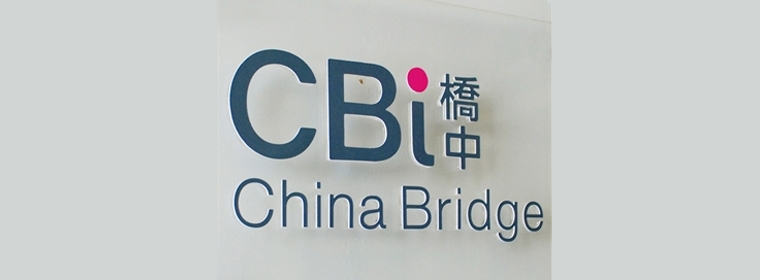
The brief for the new logo that came out of the research sessions was that it needed to be more vibrant, easier to recall and more versatile. This lead to the new, crisp grey typeface on a white background, punctuated by a pink dot above the “i”.
Another key need was to clear up any ambiguity over CBi’s name.
Previously, the moniker CBI, with a capital “I”, was used alongside China Bridge International. However, clients in the East tended to refer to the company as just “China Bridge”, while clients in the West would often use “CBI”.
Deciding that the word “International” is not integral to the name, the “I” in the abbreviated form of the company name has, in the new logo, been rendered lowercase to give “CBi”. The unabbreviated form will drop the word “International” in all communications except in formal situations such as contracts and legal documents.
This standardization is, of course, followed by the new logo, which uses both CBi and China Bridge.
The revamped website is far more visually appealing that its predecessor, while also being far easier to navigate. It is also far more bold about CBi’s successes, how these have been achieved, and how prospective clients can expect to benefit from working with CBi. Company news has also been given more prominence, with a front page ticker and dedicated section.
CBi is all about using in-depth findings about cutting-edge trends to empower companies to succeed. This is exactly what we have done for ourselves during this revamp. We are now well placed to continue helping businesses empower their designs through the use of research-based insight.

